They Might Be Giants
Most of my visualization experience has been for KPI presentations to stakeholders and business leaders. Something that has fascinated me while browsing other people’s Tableau work are the infographic-style dashboards that one might see in a magazine or on a web site. As a result, I decided to build an infographic for one of my favorite bands, They Might Be Giants.
I got to try new things like swapping out dots for icons like the YouTube logo when displaying the number of plays that Istanbul (Not Constantinople) has. I employed color usage in a chart on total studio albums released to make TMBG stand out against the totals of greats such Elvis Costello and The Rolling Stones. I was even able to insert a photo of the band into the middle of the dashboard - definitely nothing I’ve ever been able to do while explaining to the Vice President of Production how our decreased scrap rate is leading to higher profitability.
Overall, this project was a lot of fun. It was a rare occasion where I got to look at all of the data available and pick exactly what I wanted to talk about. Plus, I learned a lot of unique ways to make the data stand out the audience. By utilizing these data presentation techniques, I think it can make the dashboard just as interesting to a TMBG novice as a long-time fan.
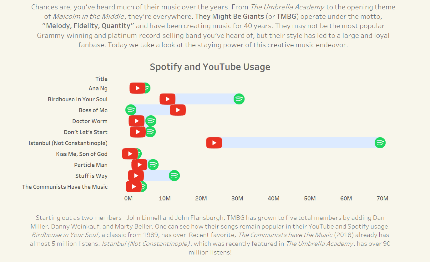
Showing the (massive) gap between YouTube and Spotify plays. I'll add that I'm surprised at the difference, as TMBG has been on YouTube for way longer than Spotify.
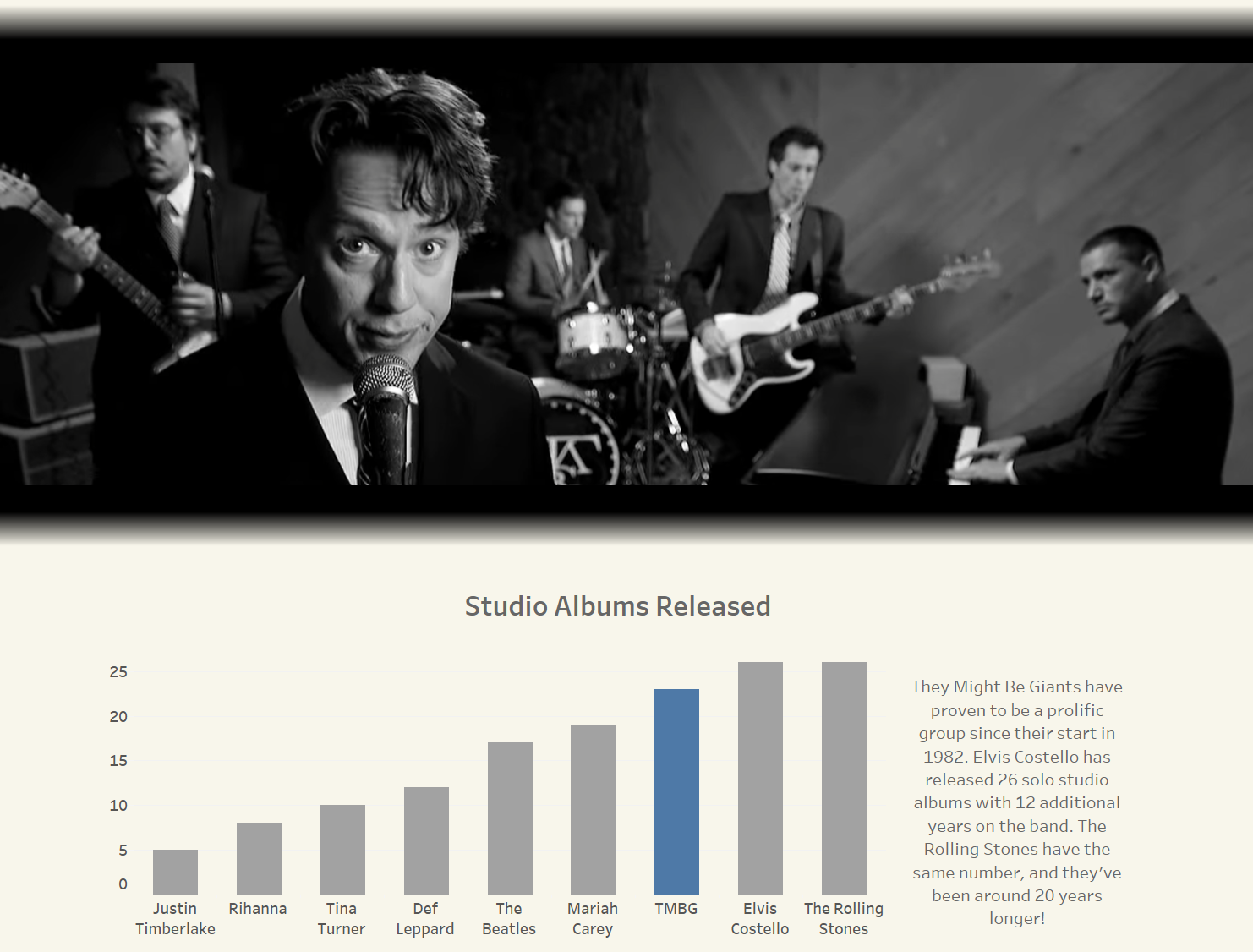
While I presented a lot of things that *I* wanted to see, I was genuinely shocked that they had that many albums. Which is kind of silly, because I own all of their albums. I should know better.
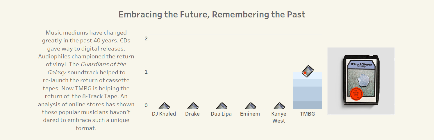
I thought it was hilarious that They Might Be Giants were selling 8-Track tapes, so I had to include a graph highlighting it.
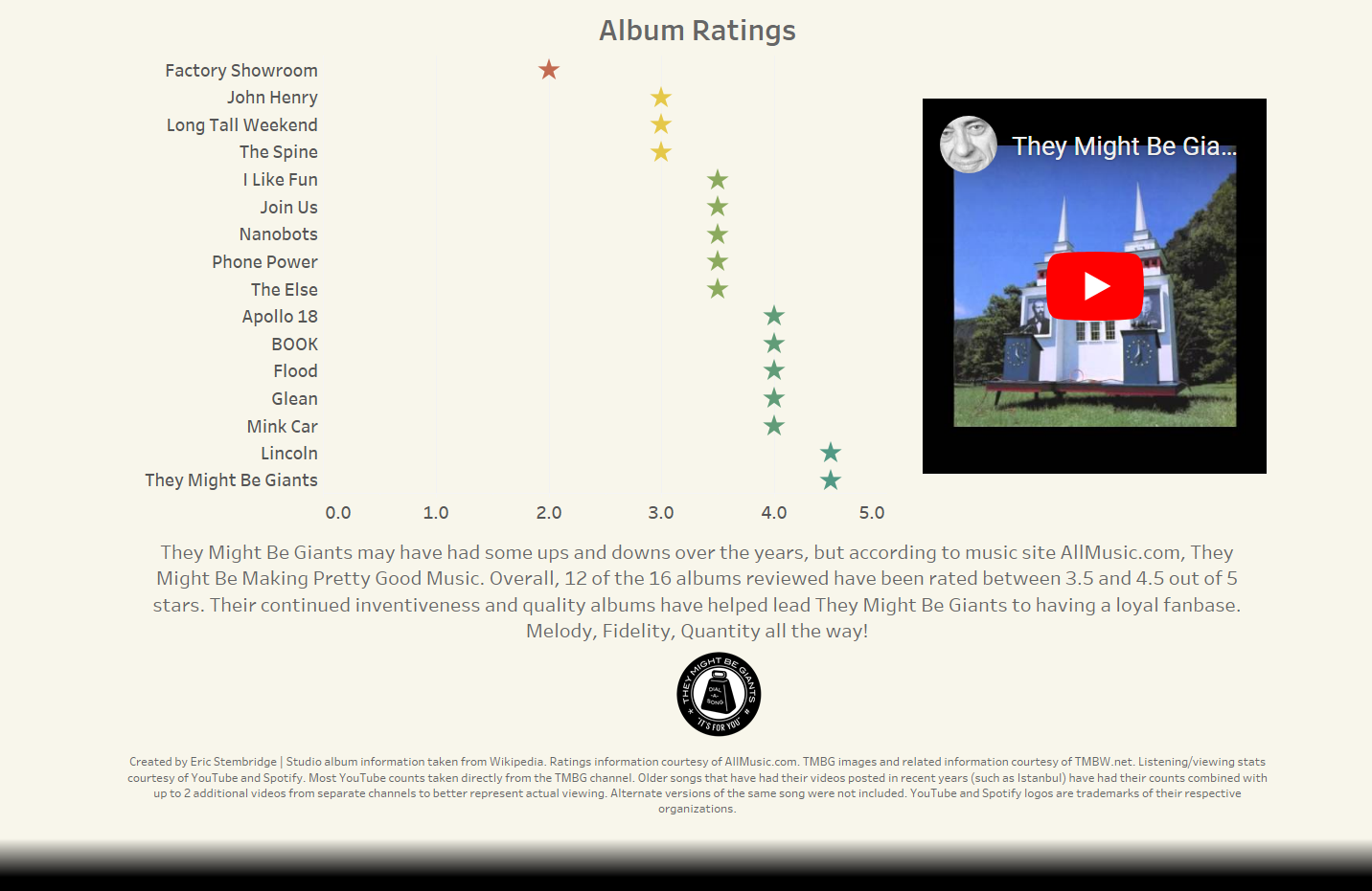
Lastly, I threw together a color-conditioned graph showing the ratings of all of TMBG's albums. The best part is that each album you select, the box on the right plays a song from the album you just clicked!